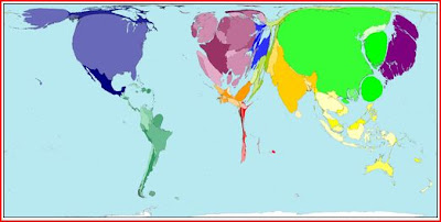
Wealth in ~1500
 Wealth in ~1960
  Wealth in ~1990
 Wealth in ~2000
  Wealth in ~2015
Here is a series of maps that display the distribution of wealth by country over time. The sizes of the countries on the maps have been adjusted to reflect the percent of world wealth. Thus France is larger than Brazil on the maps, even though, geographically, Brazil is larger.
We can see that Europe has had a good run for the last 500 years. China and India, less so. I don’t trust the numbers for the New World circa 1500. Charles Mann has made the case that the field of pre-Columbian studies has changed dramatically in the last quarter century. I don’t think the reference books in the field of economic history have had a chance to catch up.
.
Projecting forward to 2015, it looks like the distribution of wealth in the Old World will look more and more like it did back in 1500. The more things change, the more they stay the same. India and Africa are expected to underperform compared to their relative performance 500 years ago. Room for improvement? Cause for optimism?
.
Worldmapper includes this little statistical gem with its map of wealth in 1900:
In 1900 the world[’s] total [wealth] was US$2 trillion when expressed in 1990 purchasing power parity.
2 trillion dollars! The bailout alone will cost more than that this year, not to mention the price tag on the new and ambitious social programs that Uncle Sam has in store for us. One thing we can say is that the world is a lot wealthier now than it was 100 years ago -- a lot. The relative distribution of wealth reflected in the series of maps overlooks the growth in absolute terms. There is a lot more wealth around that can be safely wasted.
.
Or can it?
.
Source: Worldmapper
0 comments:
Post a Comment